
Web design prompts for ChatGPT and Claude
Good prompts for website design give the AI your brand, audience, page goal and 3 words for the look, then ask for a section layout, a type scale, a colour palette and Cascading Style Sheets (CSS) tokens.
Task prompt
1+3
- ChatGPT
- Claude
- Gemini
The prompt
Fill in the fields and the prompt updates as you type.
Design brief: direction, palette, type and section order
Naming the habits to drop and checking contrast gives you a design with a point of view, not a template.
Your details
Type in any field. The prompt fills in as you go. Leave one empty? It stays a highlighted blank.
Your prompt
Any model
You are a senior web designer and art director. Write a design brief for a website. Don't write code.

Business: {{business}}
What it offers and the one action a visitor should take: {{offer_action}}
Who visits and what they care about: {{audience}}
Feel in three words, and one word to avoid: {{feel}}
Brand colours, logo or fonts to keep (or "none"): {{brand}}
Pages needed: {{pages}}

Give me
1. Design direction: three sentences describing the look and the idea behind it. Then name four habits to avoid so it doesn't look like a template, for example a purple-to-blue gradient hero, three identical icon cards, stock handshake photos or everything centred.
2. Colour palette: five colours with hex values and a job for each (background, text, primary action, accent, border). Aim for at least 4.5:1 contrast for normal text (the WCAG AA level). List the pairs you checked, and if you can't compute contrast reliably, say I should verify each pair in a contrast checker.
3. Typography: a heading font and a body font available on Google Fonts, with sizes for H1, H2, body and small on desktop and mobile, plus line height.
4. Homepage layout: the sections in order. For each, give its purpose, what it contains and a layout note, such as "text on the left, photo on the right, photo below on mobile". Put the main action above the fold and repeat it once lower down.
5. Imagery: what kind of photos or illustrations to use, what to avoid, and what to shoot or collect.
6. Details: a spacing scale, a corner radius, a button style and one signature detail that makes the site feel specific to this business.
7. Mobile: what changes at 390 px wide.

Don't invent testimonials, statistics or awards. Keep it to what I can build. Don't use em dashes or en dashes.
Claude
<role>You are a senior web designer and art director. Write a design brief. Do not write code.</role>
<business>
Business: {{business}}
Offer and main action: {{offer_action}}
Visitors: {{audience}}
Feel: {{feel}}
Brand elements to keep: {{brand}}
Pages: {{pages}}
</business>
<brief_sections>
1. Design direction in three sentences, plus four habits to avoid so it doesn't look like a template.
2. Palette: five hex colours, each with a job (background, text, primary action, accent, border). Aim for at least 4.5:1 contrast for normal text. List the pairs checked, or tell me to verify them if you can't compute contrast.
3. Typography: heading and body fonts from Google Fonts, sizes for H1, H2, body and small on desktop and mobile, and line height.
4. Homepage sections in order, each with purpose, content and a layout note. Main action above the fold and once lower down.
5. Imagery: what to use, what to avoid, what to shoot.
6. Details: spacing scale, corner radius, button style, one signature detail.
7. Mobile changes at 390 px wide.
</brief_sections>
<rules>No invented testimonials, statistics or awards. No em dashes or en dashes.</rules>
Gemini
Act as a senior web designer and write a design brief (no code) for this website.

Business: {{business}}. Offer and main action: {{offer_action}}. Visitors: {{audience}}. Feel: {{feel}}. Brand elements to keep: {{brand}}. Pages: {{pages}}.

Cover, in order: design direction in three sentences with four template habits to avoid; a five-colour palette with hex values, jobs and contrast checks (4.5:1 for normal text, or tell me to verify); heading and body fonts from Google Fonts with sizes for desktop and mobile; the homepage as an ordered list of sections with purpose, content and layout notes; imagery guidance; spacing, corner radius, button style and one signature detail; and what changes at 390 px wide. Don't invent testimonials or statistics. Don't use em dashes or en dashes.
How to use
- Copy it with the button above.
- Fill the blanks in {{double braces}} with your own details.
- Paste it into ChatGPT, Claude or Gemini and send it.
- Then follow up: ask for one change at a time.
Before you run “Design brief: direction, palette, type and section order” for the first time, the lesson on how to use ChatGPT prompts walks through copying, filling and sending it.
What are good prompts for website design?
Good prompts for website design give the AI your brand, audience, page goal and 3 words for the look, then ask for a section layout, a type scale, a colour palette and Cascading Style Sheets (CSS) tokens. The main prompt names 4 template habits to skip and asks for one signature detail.
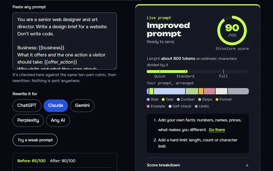
Web design prompts variations
Turn a design brief into CSS design tokens
Tokens named by job make the brief usable by any developer or AI builder, and the contrast note covers what the model can't compute.
Turn the design direction below into CSS custom properties I can paste into a stylesheet. Output code only, plus a short usage note.

Design direction: {{direction}}
Palette (hex values and their jobs): {{palette}}
Fonts: {{fonts}}
Base font size: {{base_size}}

Provide
- A :root block with colour tokens (background, surface, text, muted text, primary, primary hover, accent, border), a type scale of six sizes using a consistent ratio, a spacing scale of eight steps, radius and shadow tokens.
- A second block for dark mode using prefers-color-scheme, with colours that keep at least 4.5:1 contrast for body text.
- Names that describe the job, not the colour (--color-text, not --color-grey-900).
- A note listing any pair of colours you couldn't confirm for contrast, so I can check them.

Don't add components or layout code, and don't use em dashes or en dashes in the comments.
Critique my page design and rank the fixes
Ranking fixes by effort gives you an order of work, and the 'say so if you can't judge' rule prevents invented findings.
Critique the design of this web page. I can't show you a screenshot, so I'm describing it, or pasting its HTML and CSS below.

What the page is for and who it's for: {{purpose}}
Description or code:
{{page}}

Review it under these headings, in this order
1. First five seconds: what a visitor would understand, and what they would miss.
2. Hierarchy: is the most important thing the biggest, boldest thing?
3. The main action: is it clear, repeated once, and easy to tap on a phone?
4. Text: line length (aim for about 45 to 75 characters), line height, size and contrast. Check contrast values only if I've given you the colours, and tell me which pairs to test.
5. Spacing and alignment: where does it feel cramped or uneven?
6. Images: do they say something specific about this business?
7. Mobile: what is likely to break at 390 px wide?

Finish with a ranked list of the five fixes with the biggest effect, each with the effort (small, medium or large). If something can't be judged from my description, say so instead of guessing. Don't use em dashes or en dashes.
Design a site in rounds with a state card
Choosing a direction before details, and logging each decision on a card, stops the design wandering as the chat grows.
You are a senior web designer and art director. We'll design one site together over several rounds, one decision area per round, and you keep a state card so nothing gets lost.

Rounds
Business: {{business}}. Main action: {{main_action}}. Visitors: {{audience}}. Feel: {{feel}}.
1. Direction round. Give me three distinct design directions, each in two sentences, with the habits it avoids. Then wait for my pick.
2. Palette and type round. Five hex colours with jobs, a heading font and a body font from Google Fonts, and the contrast pairs I should check.
3. Homepage round. The sections in order, each with its purpose, content and a layout note for desktop and mobile.
4 and later. One more page per round, or one section's detail per round, when I ask.
Final round (when I type guide): a one-page style guide I can hand to a developer or an AI builder.

Commands (I'll type these)
next: approve this round and do the next one.
revise: <note>: redo the last round with my note. revise N: <note>: redo round N only. Change nothing else.
status: show the state card only.
pick: <number>: choose that direction and move on.
guide: run the final round.
stop: show the state card and stop.

Every reply, in this order
1. This round's work.
2. Check, one line, pass or fail per item: one clear main action; contrast pairs listed for me to check; no invented testimonials or stats; consistent with earlier decisions.
3. The state card, in this shape:
```
STATE | website design | round N
Goal: <business and main action>
Direction chosen: <name or not yet>
Palette: <hex values with jobs>
Fonts: <heading, body>
Pages designed: <list>
Decisions: <D1, D2 ...>
Needs from me: <questions>
```
4. One line telling me what to type next.

Rules
Don't write code. If a choice depends on something I haven't told you, ask and wait. Don't use em dashes or en dashes. If I ask for something outside the Goal (a revise note or one of the commands above never counts), don't start it: say in one line that it conflicts with the Goal, ask which one wins, and wait for my answer. Never change an approved round unless I type revise with its number. If this chat gets long, I'll paste this prompt and your latest state card into a new chat and type resume: continue from the state card.
What a good answer looks like
A good answer to “Design brief: direction, palette, type and section order” looks like a finished piece in the format that prompt asks for, built only from your details. Yours will follow your own details.
Purpose: say what the clinic does, and get the booking click. - Contains: logo, nav (Services, About, Prices, Contact), a headline in plain words (for example "Sports injury physiotherapy in Leeds, from people who listen"), one supporting sentence, the "Book your first appointment" button, and the next-available line (see section 6). - Layout: text on the left (about 55%), a large photo of a physio treating a patient on the right with a rounded corner and slight overlap onto the next section. On mobile, text and button come first, photo below.
Notes for each model
ChatGPT
works as pasted. If you upload a screenshot of an existing site, add
use the attached screenshot as the starting point.Claude
the tagged version suits this task. Claude can produce a working HyperText Markup Language (HTML) mock-up, if you ask in a follow-up.
Gemini
use the plain version. Ask for the palette as a table to copy it faster, since you'll paste the hex codes into your builder.
All models
they can get contrast and font availability wrong. Verify both before you build, so don't trust either until you've checked.
Why do AI-designed websites look the same?
AI-designed websites look the same when the prompt gives no brand detail, so the model falls back on 4 clichés: a gradient hero, a row of three identical cards, stock icons and centred text everywhere. A request for "a modern website for a clinic" gets the average of every clinic site, with a stock photo of a smiling person on top.
The fix is to be specific about who the site is for and which habits to skip. This prompt asks for three things most prompts don't:
- Habits to skip. Four named template clichés, so the AI can't fall back on them.
- A signature detail. One thing that makes the site feel like it's yours, not a template's.
- Contrast pairs. Chat models can't check colour contrast reliably, so the prompt makes them list the pairs and tells you to verify them.
That's the step people skip. The prompt isn't a design tool and it won't fix a weak brand; it's a way to ask better questions.
How do you make a website design look less like AI?
To make a website design look less like AI, ban the 4 template clichés in the prompt, name 2 real sites you like and ask for one layout choice that breaks the grid. Put the two sites in the brand field, and keep the signature detail line so the result has one thing no template has.
- Fill in the six fields, including three feel words and one word to steer clear of. Those feel words do a lot of work.
- Run the prompt and read the direction first. Change the feel words and rerun if the direction doesn't feel right.
- Check each colour pair in a contrast checker, since the AI can't do it for you. Normal text should reach 4.5:1 and large text 3:1, the Web Content Accessibility Guidelines (WCAG) AA level.
- Use the tokens prompt to get the CSS variables, or paste the brief into your site builder or to your developer.
Use real photos of your own work where you can, since visitors can't find those elsewhere. Try the ChatGPT prompt to build a website and the coding prompts if you're writing the site itself. For images to go on it, see the AI image prompts, and browse the ChatGPT prompts hub for more.
Can ChatGPT or Claude design a website from a prompt?
Yes, ChatGPT and Claude can design a website as a brief, CSS tokens and a code mockup, but you still check the result in a browser, since neither sees the rendered page unless you show it.
The AI can't measure real contrast and hasn't tested your layout on a phone, so review it at desktop and mobile widths, where problems show. Don't expect it to replace a design check, and you'll still want a real person to look at the layout. Claude can return a single-file mockup you open in a browser. For the full build brief with pages and content, use the website prompt next, since this page covers design direction only.
Web design critique prompt for your mockup
The web design critique prompt reviews your mockup under 7 headings, including hierarchy, spacing, contrast, type and the main call to action (CTA), and ranks the 5 fixes with the biggest effect, each with a small, medium or large effort.
Give it a description of the page or its HyperText Markup Language (HTML) and CSS, and it says so when something can't be judged from your description instead of guessing. It doesn't invent testimonials or statistics, since the prompt forbids them.
Clinic websites need plain, calm layouts, and therapists building one will find planning help in ChatGPT for SLPs. Your About page needs words as well as a look; the ChatGPT prompt about yourself drafts a bio from facts you give.
Web design prompts FAQ
Still stuck? Build it in Prompt Studio. It'll score each part as you go.
What contrast ratio should website text have?
Website body text should reach a contrast ratio of 4.5:1 or more, and large text 3:1 or more, under WCAG AA. The prompt lists each colour pair so you can test it, including button text and links.
What are the 7 C's of website design?
The 7 C's of website design are context, content, community, customization, communication, connection and commerce, a framework from Rayport and Jaworski for the parts a site offers its users. Other guides use different 7 C lists, so check which one a source means.
Do web design prompts work in Claude?
Yes, the web design prompts work in Claude, which can return a single-file mockup you open in a browser. Use the tagged version from the Claude tab.
Is a web design prompt the same as a website building prompt?
No, a web design prompt isn't the same as a website building prompt: it sets the look, which means layout, colour and type. A working site with pages, copy and launch steps belongs to the website prompt page.